You don’t realize how important a good brand identity is until you see a bad one. Just last year, in August 2025, Cracker Barrel released a new logo and brand identity that made the internet explode. “The new version of the logo, which was unveiled along with a new menu on 19 August, removed the image of a man sitting in a chair and leaning against a barrel – known as the “Old Timer” – and replaced it with an emblem featuring only the chain’s name. That sparked accusations that the company, known for its Southern-style comfort food and nostalgic atmosphere, was abandoning its roots” (BBC News). When you see a good brand identity, you don’t bat an eye. But when you see a terrible one, it is so obvious. That is why good design and brand identity are so important.
When building a brand, there are so many different elements that are involved. You have a main logo, secondary logos, a cohesive color palette, different fonts and typefaces, patterns, and so much more. All of this comes together to create a good brand identity. A brand that did a great job of creating a brand is the Vegas Golden Knights of the National Hockey League. They introduced their brand in the 2017, while the league was changing jersey manufactures, so they had a fantastic opportunity to do something unique and different. This especially made sense as Vegas is known for being very bold so it would be logical for their a hockey brand to do the same.
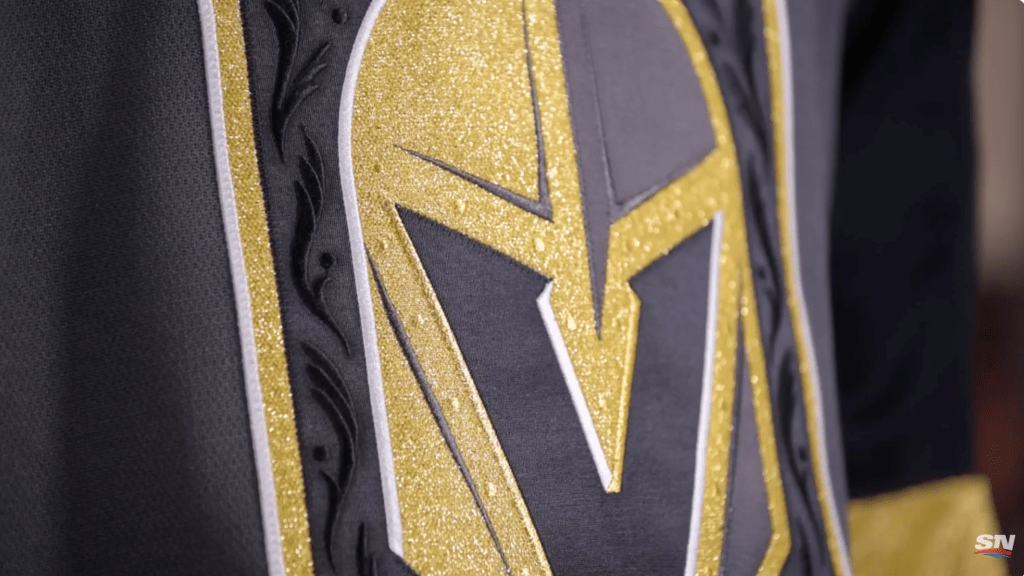
SportsNet put together a mini documentary going over how the Golden Knights got their name and logo and it gives great insight into the process. They interviewed Tom Koukodimos, the executive creative director, and Chris Creamer, the founder of SportsLogos.net, who went over all the intricate details of the brand. They did a great job showing how they took that bold look and intrudced it to Vegas’ first major sports team. For example the primary logo has a hidden “V” inside of it for Vegas as well as having special embossed patterns in it when it is stitched on the jersey. In addition, the secondary logo is based on the stars seen on the Las Vegas sign mixed with two crossing swords. All of this genius comes together into one cohesive brand.
To avoid creating a bad brand, you need to make sure you are making choices with a purpose. If you are changing or adding something just for the sake of it, it probably isn’t a great idea. In addition, when you are designing, it is important to target it towards your audience. In the Cracker Barrel example, many of their customers are older, according to Cracker Barrel themselves, 43% of customers were age 55+, so getting rid of the charm and character in place of a minimalist design is a bad idea. Designing with purpose for the brand and the consumers is the most important part.
When you compare a great brand and a terrible brand, it is really night and day. A good brand immerses you into the world and is cohesive from social media to print, to everything in between. Bad design makes even non-creatives look at it and wonder, “Did a first grader make that?” That’s why it’s so important to put a lot of time and effort into building out a brand identity.


Leave a Reply