Having a good website is crucial for a business to grow. This one place has everything a consumer would need to know about what your brand is about and what or how they do it. According to Wix, “A good website should excel in both its form and function, with a clear purpose, visually appealing design, and intuitive navigation.” The two websites that I reviewed below have done a great job of not only making a functional website but one that is true to their brands.
Apple’s website fits their entire theme: clean. Large images, monochrome colors, and sleek buttons all come together to make it feel like Apple. In addition, the UI used on the website is identical to what could be found on an iPhone, MacBook, or any of their products. Upholding this brand identity is so crucial in making Apple such a well-known brand. On top of just the aesthetics, the navigation on the website is done very well, making it very clear how to buy a phone, computer, headphones, or anything else.
Chick-fil-A has also done an excellent job with their website despite it being very different. Unlike having a sleek design like Apple, Chick-fil-A has leaned into its playful side and made the website feel very fun. They achieve this with creative fonts and playful headings. This definitely fits the community atmosphere of the chicken brand. Despite this, they do a great job with navigation and getting consumers to buy their product. On the very top of their site, they have the ability for you to view the menu, order catering, and even get things from their shop. Breaking it up this way is very useful and gets the consumer what they want quickest.
Regardless of both sites being very different from each other, both Apple and Chick-fil-A have done a great job marketing themselves with their websites and overall designed something very smart. Both of their brands really shine through and, with that, encourage you to want to order food or a phone.
“Graphic design is a form of communication that utilizes colors, shapes, images, and words to create visual content in various forms—primarily print and digital media. Effective designs communicate information in a way that inspires and informs consumers, making it a critical element for any business’s success” (Coursera). Being able to take concepts and communicate what they do and how they do it is very important. This relates strongly to design fiction, which explains how and why a visual designer does what they do.
Design fiction uses design, storytelling, and ideas to come up with possible solutions, especially relating back to possible futures. Using the process, which includes scenario planning and the cone of plausibility are very important in executing this. The scenario planning starts off the entire process by coming up with different situatuons that could happen. This requires all outside information to help improve the overall idea. This leads to a cone of plausibility, which is where you determine what is possible. This is where you funnel through the ideas and see what makes sense for the project ahead. According to Science Direct, “The intelligence analysis domain is a critical area for futures work. Indeed, intelligence analysts’ judgments of security threats are based on considerations of how futures may unfold, and as such play a vital role in informing policy and decision-making.” Using both scenario planning and the cone of plausibility, you are able to come up with well-rounded ideas for the design task. From there, you use design fiction to execute the plan. This can really be any facet of design, including branding, web development, or user Interface and user experience design.
This can relate back to every design project done. For example, you can use these steps to come up with a plan on how artificial intelligence is used inside of a college setting. You first could come up with a hypothetical of what could happen. In this example, it could be solutions like universities embracing AI for student use, then coming up with regulations, or maybe colleges adapting their curriculum to not include any work that could be done by artificial intelligence. The cone of plausibility is then used to see what is realistic. Obviously, colleges can’t lean fully into AI, as that would take away from the education process, but also can’t outright ban it either because students would still find a way to use it. What would be more realistic would be for universities to adapt their curriculum and to put rules and regulations in place. Coming up with the actual solution is the difficult part, but it could include using design fiction to come up with a website, app, or program that integrates AI and academia.
Overall, design fiction is very important when it comes to graphic designers. It helps process and conceptualize ideas and create products for clients. School of Critical Design describes it perfectly, saying “the role of Design Fiction becomes ever more significant – not just in the world of design, but in shaping societal discourse and influencing decision-making.”
When wanting to represent your brand, it is important that you have a good, cohesive design that makes the consumer’s life easy. This is especially important when it comes to websites and their design. According to Forbes, “A website is not merely a place to list services and provide contact details. A website helps visitors know more about your ethos, operation style and brand aesthetic, which are all important when building interest and engagement.” This shows how important a good brand is and how you can translate that into good web design.
Two websites that I think do an excellent job with their web presence are IKEA and Airbnb. Both of these brands use images, typography, and iconography in a great way to show products and explain what and how the consumers can do and how. For example, IKEA does a great job of using product cards to show variations of the furniture and the different colors and styles it comes in. In addition, they show these affordances off in real house sets so you can see what it would look like in a real setting. A great signifier that Airbnb has on their website is the search bar at the very top. It simply asks you where you want to go, what dates you are traveling, and who’s going. With just these three simple questions, it is able to find you great results for a place to stay. These are two great examples of how user-friendly these websites are
In addition, they are mapped very well, making it super easy to go from searching for products to actually buying them. For example, on Airbnb, you can simply filter your search, pick the place you want to stay, confirm the dates, and go straight to booking it. It is also as simple on IKEA’s site, where you can go from looking at a product to adding it to your bag and eventually purchasing it very simply.
Overall, both IKEA and Airbnb do a great job at their web design and make it super simple for their consumers to access and buy their products. Having well-branded and great-functioning websites is super important in the digital age, and both of these companies have done excellently at ensuring this.
Storytelling is a very valuable tool used in marketing, graphic design, and other forms of media. It helps sway the target audience into feeling a certain way or doing a certain thing.
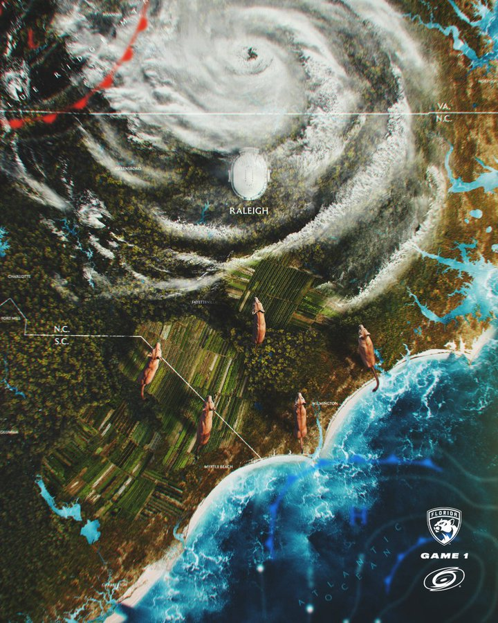
The graphic above comes from the NHL team, the Florida Panthers, as part of their 2023 Playoff Campaign. This was a hyperrealistic graphic created for Game 1 of the 2023 Eastern Conference Final against the Carolina Hurricanes. The creation behind this graphic is so impressive and shows the perfect balance between the Hurricanes’ and Panthers’ brands. It shows an overhead map, specifically showing North Carolina and the Hurricanes’ home arena. Over the top of the arena, there is an actual hurricane taking up a third of the graphic. Despite showing a good chunk of the opponent’s branding, the Panthers are crawling in from Florida and circling the arena. Overall, I think this is a very well-created graphic and does a great job of hyping up the game.
The graphic above is the gameday graphic made by the Carolina Hurricanes. This was also released for the beginning of the 2023 Eastern Conference Final and was a great combat to what Florida created. It shows a Panther at the bottom of the graphic slowly being tempted by treats. This carries your eye to the top of the frame, which shows the Hurricanes’ home arena surrounded by the natural disaster. The icing on the cake is the “Here Kitty Kitty” tagline, which perfectly describes the graphic. This is a super well-designed and creative graphic made by Carolina’s design team, and it did a fantastic job of building up hype for the game and the series. This is especially cool as this wasn’t connected to the Florida graphic from above at all. Both design teams created them independently, and they ended up working so well together.
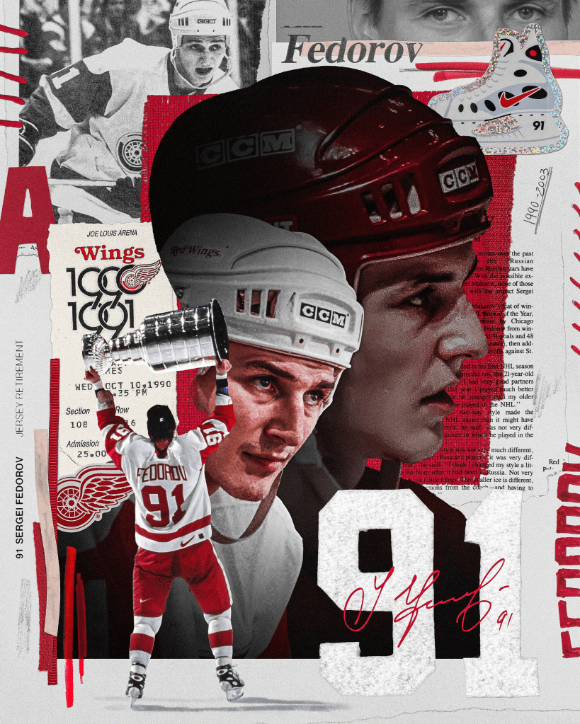
The next graphic comes courtesy of the Detroit Red Wings. It was created to celebrate Sergei Federov’s jersey retirement. I believe this graphic does an excellent job celebrating and telling the story behind his career. In addition to photos of him, elements such as his number, nameplate, his assistant captain patch, and signature are used. On top of that, ticket clippings, newspaper articles, and other elements are used to tell his story. I feel like this collage comes together so well and really shows all the elements of his career. The designer definitely did a great job using both digital and physical media to create this piece.
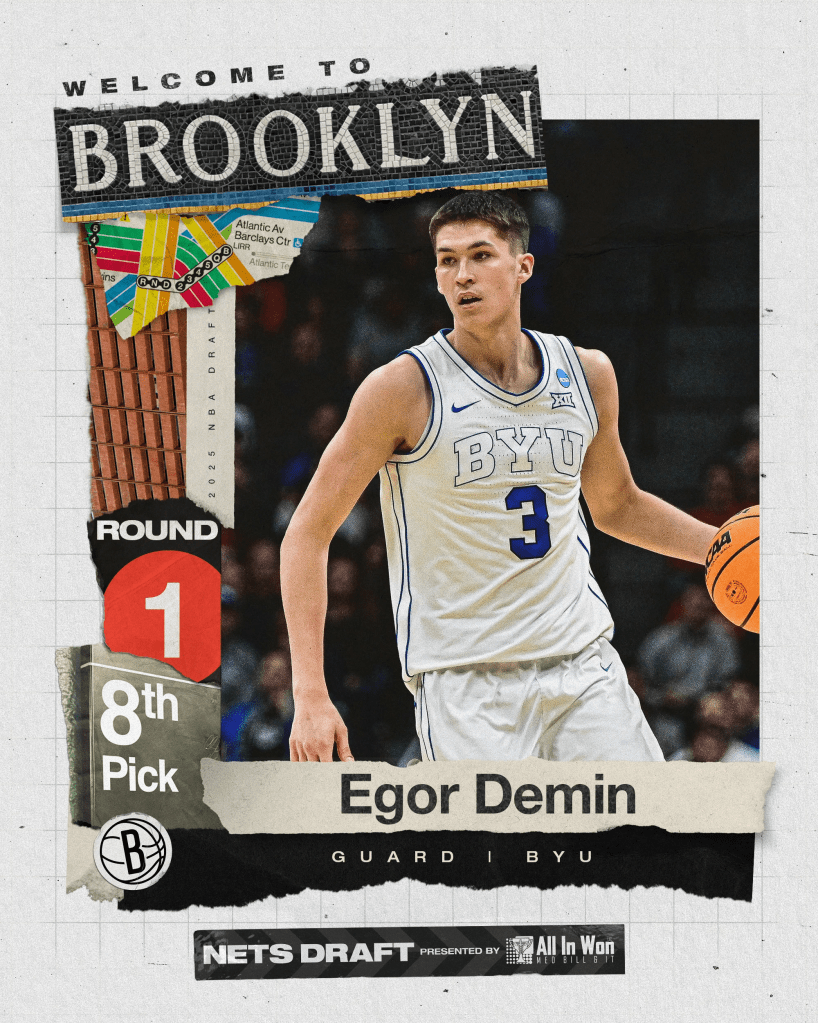
The Brooklyn Nets are the next team that I want to highlight. The graphic above comes from their 2025 NBA Draft campaign and does a great job of telling a story. The main point of the graphic is to show that they drafted guard Egor Demin, but the graphic shows so much more than that. The Nets designer used several New York City elements, specifically from the subway, to really welcome him to New York. This includes tiles that spell out Brooklyn, a subway map, the circular number one from the subway, and the sign with also comes from the train system. On top of all of that, they made a very conscious decision to use “Helvetica,” which is the font used in the New York City subway system. All of these elements were used very well to welcome Egor to the team and represent the city of New York.
The Vegas Golden Knights come up with another hyperrealistic graphic for their 2023 playoff series versus the Dallas Stars. The graphic shows A dragon with a knight riding it, flying over the Dallas Stars’ arena. The background shows the Dallas skyline and a sky full of stars, which is very appropriate for the team’s opponent. To add to the Golden Knight’s branding, the font used on the graphic looks very medieval. In addition, the gold is very strong in this graphic, which also ties back to the brand. All in all, it is very Vegas and helps build hype for the game.
This 2024 London Series comes from the New York Mets. They did an excellent job of mixing British landmarks and mixing it with their brand. Some elements in this graphic include the Big Ben clock tower, iconic red buses, and the United Kingdom flag on the edges. Leaning over these landmarks are three Mets players in action poses. Compared to the rest of the graphics created by the Mets that season, this fits really well and adds some great British influence.
This World Cup graphic was create by an indepentent designer for the Portugal vs Spain. The graphic does an excelent job of mixing real life elements and tieing it back to each country. The bull in the foreground represents Spain viewing the Portugal’s ships in the distance. The ships represent Portugal very well as they have a long maritime history. This all comes together in one sports graphic meant to represent the biggest soccer tournement in the world.
Hockey is known as this masculine sport: big hits, fist fights on the ice, 100-mile-per-hour slap shots, and so much more. According to Gettysburg College, “Notably, this sport includes many different expressions of physicality and aggression which is seen within body checks and physical contact that happen at all levels. But it is most easily seen within fist fights that occur at the professional level, in which players are minimally punished.” Obviously, all of these big moments are the ones that are talked about by mainstream media and fans alike. Regardless if this is considered good or bad, there is a huge aspect of hockey no one talks about: the gear and how it works.
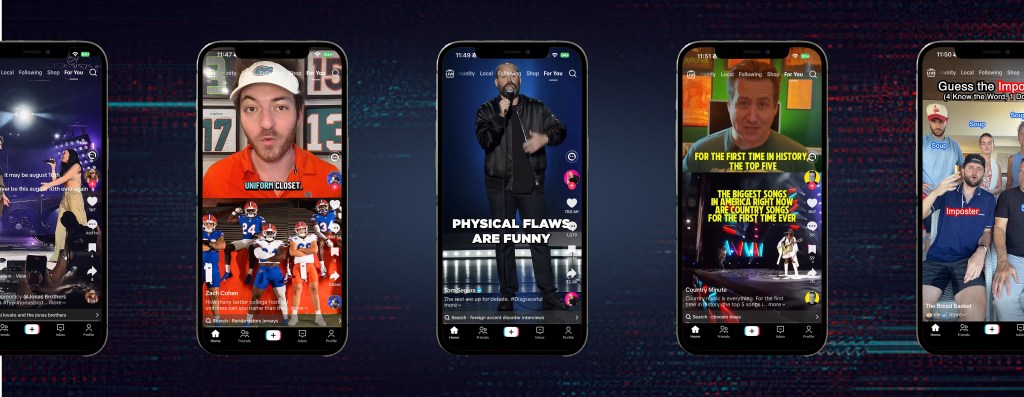
When coming up with concepts for a research-based creation, I thought I could mend that gap. It seemed like an untapped market that many hockey fans could care about. I believe seeing the progression of this gear could be quite interesting, and showing off the safety facts on social media could aid hockey players and fans alike. I took this concept and created a TikTok page that created short-form content that showed these topics off.
The four topics I created content about are:
Hockey Skates The video explored how modern hockey skates have evolved beyond a simple boot and blade. The content examined the construction of the boot, tongue, tendon guard, and blade, while connecting those components to performance and player safety. The video also explored the evolution of skate blades and the safety concerns that influenced modern blade designs.
Neck Guards The video starts by talking about the unfortunate and unexpected death of professional hockey player Adam Johnson and the effect it had on the hockey community and the overall safety regulations. The story was used in the hockey world to demonstrate the importance of neck laceration protection and the research surrounding cut-resistant materials, coverage, sizing, and fit.
Goaltender Gear The point of the video was to go through the major parts of goalie equipment, from the mask and chest protector to the gloves, blocker, and leg pads, while comparing modern gear materials to the heavier and bulkier equipment used in the past.
Helmets and Concussions The video explained how helmets are designed to reduce impact forces and protect against serious head injuries, while also discussing the role of helmet construction, liners, fit systems, and rotational forces.
Overall, the entire goal of the series was to spread the information about hockey technology and safety in an easy-to-digest way, and it seemed to be successful. In the words of five-time Stanley Cup winner and NHL legend Mario Lemieux, “We, as a league, must do a better job of protecting the integrity of the game and the safety of our players.”
To learn more about “Beyond the Boards,” check out the case study here.
Being an influencer is the most desired profesion for the younger generation. The lavish lifestyle mixed with the popularity seems to be very desrirable. According to Fortune, “Gen Alpha watched influencers make millions from daily vlogs and video game content—now they want a piece of the pie. The generation’s top career choice is to become a YouTuber or TikToker, according to a recent survey of 12 to 15-year-olds.” This centiment was also ecoed by CNBC, saying that “Vlogger/YouTuber” is the top career aspirations for the children of the United States and United Kingdom. Even though the fame and the fortune of the bigger content creators is inspiring, there is alot of hard work that goes into being an influencer.
Being a smaller scale creator, every responsibilty falls under yourself. This includes the research and ideation phases (which includes brainstorming, data checking, an keyword study), production (which includes writing and scripting, recording, and designing), and post-production and publishing (which includes editing, scheduling, analyzing). On top of all of this, you still need to network with other creators, do the marketing behind your channel, and legit eveyrthing else. Obviously once a content creator gets bigger, they will hire people onto their team to help them, but that doesn’t change the hard work that goes behind it.
On top of all the work, there is also big negatives that comes with content creation. With your life being public, privacy is something that gets diminished. So many vloggers have showcased their life so hard where they can’t go out without being recognized or even doxed. Creators own homes have been discovered because of their life being so public.
In addition, it seems like the mental health of content creators is lower compared to others. Some examples of these mental health struggles could be anxiety, depression, and burnout. A study from Harvard’s Center for Health Communication shows that 10% of content creators report feeling suicidal thoughts related to their work—nearly double that of the broader U.S. population. An interview with Amanda Yarnell, senior director of the Center for Health Communication at Harvard T.H. Chan School of Public Health, shows this data. She talks about how “this survey reveals the pressures that come alongside those responsibilities: The financial pressure. The obsession over content performance. The burnout. The constant toxicity. And the isolation.”Obviously these problems are very impactful and showcasing your life online can potentially make them worse. Its very important that people dealing with mental health issues have people to talk to help.
Overall, content creatior is very rewarding in several ways but it also has some negatives. It’s importnant that creators create boundries and practice safe habits in order to make sure they are mentally and physical protected. For anyone dealing with mental health issues, call or text 988 at any time or chat live at 988lifeline.org/chat.
Short-formed content has taking over social media. For the past five years, it has seem like most platforms have pushed or introduced some sort of short-form content. The rise seem to started with TikTok around the time of COVID-19. After that, several other platforms like Instagram, YouTube, and Snapchat, introduced their own form of short-form content, Reels, Shorts, and Spotlights respectively. It seems like these platforms are incentivizing influencers to create short-form content as thats what these apps are pushing. Forbes talks about how “these platforms offer a dynamic and captivating way for brands to engage with their target market, capturing their attention and leaving a lasting impression. It’s not just a fleeting trend; it’s a powerful testament to changing consumer behaviors and the effectiveness of concise, engaging content.”
The idea of short-formed content is great for creators as it is an easy way to share information or entertainment with others while needing less effort compared to a long term video. From here, you can expand your audience and create other forms of media, like long form content or music. “A viewer may discover a 30-second explanation on TikTok, become interested in the topic and then click through to read the full article. Another viewer may watch several short videos on YouTube Shorts before encountering the longer written piece (Finelight Media) .” This shows how you can grow an audience on apps like these and then transition them into other forms of content. In addition, the algorithm seen on these apps reward short-form content. I have discovered several music artists and comedians exclusively from short-form videos. This discoverability is massive for small creators as the algorithm promotes the content rather then creators.
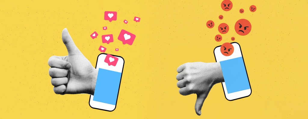
The advantage of short-form content for the platforms is how consumers interact with it. Short-form content is different from everything else as the content is being fed to you rather then the viewers needing to go out and search for it. This constant stream of content is a very easy way for a user to stay on an app for a while, which is a major goal for the platform. The longer you stay on the app the better. Dr. Nancy DeAngelis, CRNP, Director of Behavioral Health, says, “Social media platforms drive surges of dopamine to the brain to keep consumers coming back over and over again. The shares, likes and comments on these platforms trigger the brain’s reward center, resulting in a high similar to the one people feel when gambling or using drugs.” Despite it being bad for the consumers, the companies benefit on you staying and scrolling.
Overall, social media is very beneficial and short-formed content is becoming just as crucial to the platform. Finelight Media sums it up perfectly, saying “as video platforms continue to evolve as search environments, the ability to transform written research into short, searchable visual content will become an increasingly valuable skill in digital marketing.”
Social media has become one of the biggest and best ways to market a product, brand, or even a person. It is a very smart thing to leverage, as it is a great way to reach people externally. According to St. Thomas University, “The facts and figures make it apparent that social media should play a role in any marketing strategy. Not only does it allow a business to connect with a customer, but it also builds brand loyalty and can boost sales.” As someone who has worked behind several social media pages, many of which are the top of their class, I know a thing or two. Here are a few tips that I’ve learned:
1. Branding is Key.
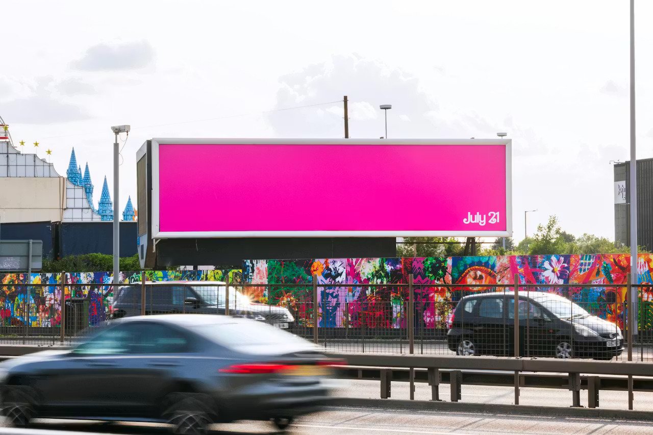
When you look at any big social media page, you can instantly tell that all of the graphics and marketing are cohesive. When marketing a product or brand, you want the consumer to recognize it instantly. A great example of this is the marketing behind 2023’s Barbie Movie. In preparation for the film’s release, they had bright pink billboards with nothing but the release date.
The Drum talks about this, saying, “There is no better campaign to demonstrate the power of classic OOH than for the Barbie movie. It’s difficult to think of the bright (pink) beacon that’s been applauded across the advertising, entertainment, and fashion industries, to name a few, of anything other than sensational.” The whole idea of this campaign circles back to branding. All the billboard was Barbie pink and the font. The fact that that’s all consumers needed to recognize the brand shows how strong it is. When designing social media branding, that should be the goal. If you are designing posts individually, this will hurt you in the long run. When I designed the branding for my social media series, Beyond the Boards: The Safety Behind Hockey, I made sure to make sure that was the case. Below is the created logo for the brand.
2. Consistency, Consistency, Consistency.
The best way to build a brand on social media is through consistently posting. It is important to use all the features of your platform to your advantage. For example, Instagram has posts, reels, edits, stories, highlights, lives, and so much more. It is important to take advantage of these in order to grow your audience. Keeping up with the Instagram example, I try to make a post at minimum of a post every other day, as well as a few stories and reels mixed in. In Forbes‘ article about this topic, they mention, “Whether you publish blogs every day or once per week, it’s crucial for your organization to choose and adhere to a schedule. When your content quality, quantity, or schedule isn’t consistent, it can confuse your customers. Keeping with a regular strategy not only helps create a better customer experience but it also helps build credibility, reputation, and brand trust.”
3. Post Content Your Audience Would Want to See
When posting on social media, it is smart to post content that is entertaining. If you are posting just straight advertisements, no one would be interested in the page. There are several ways to make your content feel less corporate while still being able to show off your product. Following trends and other similar things, it makes your brand feel more down-to-earth. This is very important to people as a brand is more trustworthy when this is the case.
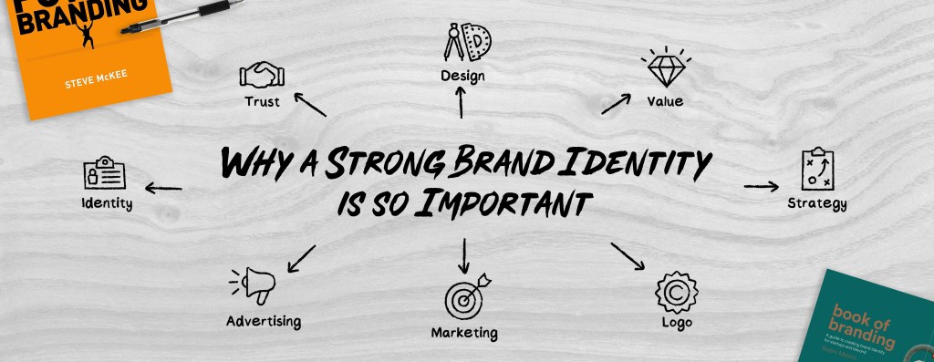
You don’t realize how important a good brand identity is until you see a bad one. Just last year, in August 2025, Cracker Barrel released a new logo and brand identity that made the internet explode. “The new version of the logo, which was unveiled along with a new menu on 19 August, removed the image of a man sitting in a chair and leaning against a barrel – known as the “Old Timer” – and replaced it with an emblem featuring only the chain’s name. That sparked accusations that the company, known for its Southern-style comfort food and nostalgic atmosphere, was abandoning its roots” (BBC News). When you see a good brand identity, you don’t bat an eye. But when you see a terrible one, it is so obvious. That is why good design and brand identity are so important.
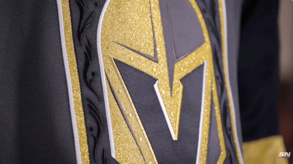
When building a brand, there are so many different elements that are involved. You have a main logo, secondary logos, a cohesive color palette, different fonts and typefaces, patterns, and so much more. All of this comes together to create a good brand identity. A brand that did a great job of creating a brand is the Vegas Golden Knights of the National Hockey League. They introduced their brand in the 2017, while the league was changing jersey manufactures, so they had a fantastic opportunity to do something unique and different. This especially made sense as Vegas is known for being very bold so it would be logical for their a hockey brand to do the same.
SportsNet put together a mini documentary going over how the Golden Knights got their name and logo and it gives great insight into the process. They interviewed Tom Koukodimos, the executive creative director, and Chris Creamer, the founder of SportsLogos.net, who went over all the intricate details of the brand. They did a great job showing how they took that bold look and intrudced it to Vegas’ first major sports team. For example the primary logo has a hidden “V” inside of it for Vegas as well as having special embossed patterns in it when it is stitched on the jersey. In addition, the secondary logo is based on the stars seen on the Las Vegas sign mixed with two crossing swords. All of this genius comes together into one cohesive brand.
To avoid creating a bad brand, you need to make sure you are making choices with a purpose. If you are changing or adding something just for the sake of it, it probably isn’t a great idea. In addition, when you are designing, it is important to target it towards your audience. In the Cracker Barrel example, many of their customers are older, according to Cracker Barrel themselves, 43% of customers were age 55+, so getting rid of the charm and character in place of a minimalist design is a bad idea. Designing with purpose for the brand and the consumers is the most important part.
When you compare a great brand and a terrible brand, it is really night and day. A good brand immerses you into the world and is cohesive from social media to print, to everything in between. Bad design makes even non-creatives look at it and wonder, “Did a first grader make that?” That’s why it’s so important to put a lot of time and effort into building out a brand identity.
Organization is so crucial when doing a project, especially at a large scale. Project management sites such as Trello, Monday, and ClickUp are designed to be a one stop shop to get a team of people on the same page. According to Purdue University, “As many organizations increasingly rely on data to achieve the best outcomes, effective project management has become more important than ever. The best project managers are data-driven themselves: using the power of data to make informed and efficient decisions on processes and approaches to different projects.” This shows the importance of these project management sites, especially since it being recommended by several universities and companies alike.
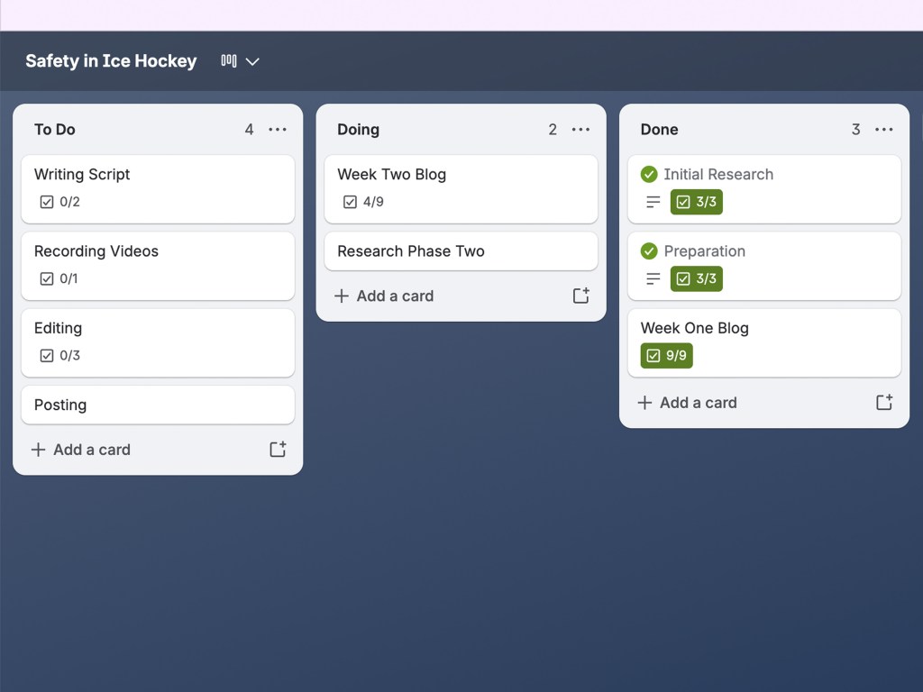
As someone who has minimal experience with project management sites, I wasn’t always on board with the idea. For one of my graphic design jobs, everything is requested and sent exclusively over email. For my job at the Recreation and Wellness Center at Quinnipiac University, all of my requests come through a Word document that I fill out and then put into organized folders. Both of these systems worked for me so I never saw a use for an actual project manager. After inputting everything for this project into Trello, the project management site I chosen to use, I can definitely see the benefit to it. One aspect of it that seems very useful is being able to use it for a multi-person team. Another professional management site, Slack, mentions how “strong communication keeps projects on track, but it’s hard to stay aligned when conversations live in a dozen different places. Project management software connects the work and the dialogue around it, making collaboration feel faster and more intuitive. Comments, tags, and shared files all live where the tasks do, so updates happen in context instead of in separate channels.” This definitely seems like a major benefit, especially when team size increases.
The biggest point of these sites has to be organization. When there are so many moving pieces to an organization, it is ridiculously important to have good communication. I know this first hand who works remotely for a hockey organization based out of Oklahoma City. Communication is very important and these project management tools make it very easy to work back and forth. The Project Management Institute talks about the importance of it, saying “for such organizations, the discipline has enabled them to improve their performance in managing projects and realize significant business benefits, a result often achieved by more discerningly selecting only those projects which specifically contribute to the organization’s enterprise strategy.” This really shows how important it is to stay organized as well as how easy it is to do so with these sites. They continue on saying, “in addition to now realizing projects that deliver expected outcomes, these organizations are also now completing projects faster, cheaper, better–and with less risk. Inspired by these results, many other non-project-oriented organizations are following their lead by establishing their own project management structures.” Overall, PMI demonstrates many benefits to a project management website. They have a great understanding of the topic as they are non-for-profit organization that specifically focuses on project management.